Orin at 10
¶ by Rob FrieselIn 2011, I created the Orin theme for this blog — layering a bunch of then new-to-me CSS3 styles on top of the “naked” Starkers theme. It was a perfect combination for me: Starkers provided the barebones mark-up and the WordPress-flavored PHP … and I got to do “the rest”. Fast-forward a year and I took the styling a step further and got some responsiveness going.
And then… not much happened on the theme for a long time.
It was doing the job. It looked fine and let me focus on writing my content — which is to say: living my life and then coming back to write about it. I was content with it.
Until…

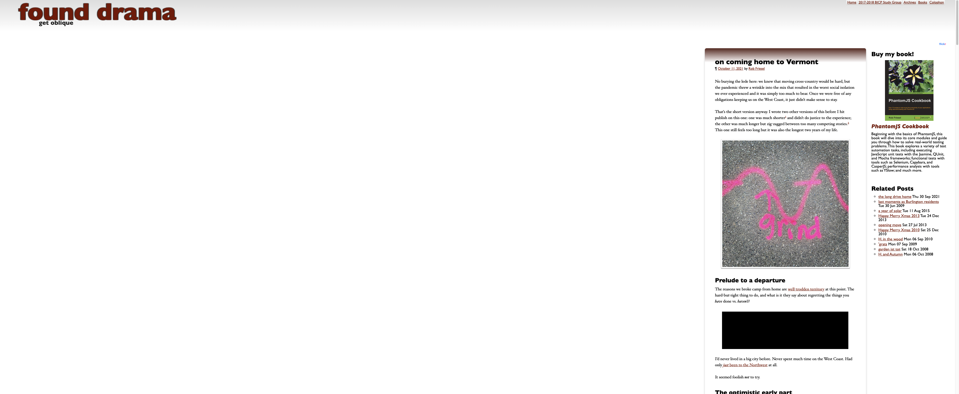
I wrote my homecoming post and it made the rounds and at least one person commented on the layout. The memorable quip that accompanied that screenshot: “So much room for activities!” 1
Why was it like that?
In 2011, it seemed like a totally reasonable to simply constrain the max-width on the main content panel to something in the 600px range. After all, you don’t want lines that are too long — that just makes it hard for the eye to track the text!
(I’m sure there were other reasons, but that’s the one I leaned into.)
“But then why is it floating to the right like that, Rob?”
I… can’t remember. I think at the time I thought (1) that screens weren’t really all that wide anyway and (2) even if they were then at least I’d have something interesting about the layout.
Why change now?
What can I say? The taunt struck a nerve.
“So much room for activities!”
Yeah, like fixing the fucking thing.
So after figuring out how to stand up a local WordPress development environment again, 2 I went straight to the offending nodes in the layout and applied some flexbox.
But why stop there?
The layout was amended and made more sense now. I still constrained the width for readability, but it wasn’t so narrow. And it would expand much more than it did before.
But some of my old aesthetic choices felt… some combination of sloppy and icky and dated. So I amended those, too.
And then I found myself with an interesting problem on my hands.
Those Flickr embeds
Long-time readers on the blog know that I’ve been using Flickr for as-long-or-longer than I’ve been posting here, and that I’ve been using their embed code for the majority of the images that appear on here.
Now the way that those embeds work is pretty clever. You grab some HTML from the site that has an <img> wrapped in an <a>, followed by a <script>. The script is interesting because it asynchronously loads, maps onto the preceding image, and replaces it with an iframe that adds some interactivity/functionality to the image.
With my 2011-era constrained with, I always used a 500px square image embed for these. But with the new and more flexible widths, I could use larger embeds if I wanted to.
There was just one problem: the script “fixed” the size of the iframes based on the dimensions specified when you generated the embed code. In other words, when the script wrote the iframe over the image it:
- Referenced the expected size in a CSS class
- Applied
heightandwidthattributes on the iframe - Applied
heightandwidthproperties in thestyleattributes as well
Holy high specificity, Batman!
How to fix that?
So for something like a 1024px × 1024px iframe, it would still be pretty easy for it to overflow even the looser constraints of the content area. Granted applying something like max-width: 100% !important to the iframe’s main CSS class would fix the width — but the high specificity explicit height was another thing all together.
You can’t just (with CSS) tell the browser “oh ignore that”. The couple “pure CSS” tricks that came to mind for that had underwhelming results. They either did nothing at all, or else the iframe would “collapse” into a thick black line across the screen.
Much as I’d hoped to avoid a JavaScript solution, it was looking like that was the only way to go.
The last time I’d needed to do anything like this was… well, even longer ago than when I’d first written the theme. Surely there had to be a solution that wasn’t noisy brute force.
Observers to the rescue
TL;DR: a combination of MutationObserver (to catch the original img → iframe rewrite) and ResizeObserver (to deal with everything after that) did the trick. Commented source like so:
Like the comment says:
It’s stupid that we have to do this at all… but here we are.
And then I just got on a roll
- Adopted GitHub Actions for my deploys
- Cleaned out a bunch of ye olde GitHub Issues that I’d filed against my own repo
- Cleaned up a bunch of other miscellaneous jank in the layout
- Turned myself into a human linter and polished up a bunch of the code, too
- Eliminated the dependency on Compass…
- …and switched to the (Dart) Sass compiler to but the build times in half
- And then dropped the totally unnecessary jQuery inclusion
Here’s to another 10 years?
- In a world where I’m more quick-witted, I would have snarked something like “glad to see your ad-blocker is working” or something. But the moment passed.[↩]
- What? I told you it had been 10 years![↩]
Leave a Reply