the Things experience
¶ by Rob Friesel![]() Back in April of ’08, I wrote a review of Cultured Code’s Things public beta. Since then, they have successfully completed their public beta and taken Things to market – and (first off) a hearty congratulations to them. If the measure of an application’s beta is your willingness to put down money for “the real thing”, then this one was about as successful as it could get.
Back in April of ’08, I wrote a review of Cultured Code’s Things public beta. Since then, they have successfully completed their public beta and taken Things to market – and (first off) a hearty congratulations to them. If the measure of an application’s beta is your willingness to put down money for “the real thing”, then this one was about as successful as it could get.
When I wrote that review, I was unsure about whether I’d be using Things in the future. It seemed simple and effective but I wondered if it would grow with me – would Things continue to meet my needs as I learned its inner intricacies? or would I find the application’s ceiling and still need more out of it? Looking back, this represents entirely the wrong approach to evaluating Things – whose strengths lie in its simplicity, in the fact that it does one thing very, very well.
Right off the bat, let’s get one thing straight about Things: it is not a project management utility. Things is not OmniPlan or Project or FastTrack. It does not do Gantt charts and dependencies and resource allocation. That is an entirely different beast. What Things does, is show you those little atomic boxes and their labels: pick up the milk and get price quote on new car and return library books. Whether you have 10 or 100 of these independent little Tasks per day, Things can handle it. As Shawn Blanc wrote:
Things not only scales horizontally – working transparently for the light GTDer and the guru alike. It also scales vertically, easily allowing you to create massively-long lists, multiple projects and detailed notes. Or, if you prefer, very few.
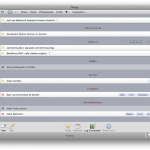
I prefer very few, but somehow quite often manage to wind up with a great many. Fortunately, Things makes this whole task management thing very unobtrusive. You have a list, you check things off, or else defer them; sometimes you bury the task in “Next” or “Someday”, and sometimes (very rarely) “Today” is empty because everything has been moved to “Logbook”. I won’t go into a whole lot of detail about this aspect of the application. That would feel like a re-hash not only of my previous post but of every other review that’s been written 1. Suffice it to day, effective use of Things looks an awful lot like this:
I’ve come to rely on Things. I’m even willing to admit that I get an embarrassingly giddy little thrill from checking off those little boxes throughout the week.
But onward with the review.
First, let’s cover some old business:
The Logbook. I touched on this in passing in my initial review; I wrote:
There is no bloat here; though I wonder what ~/Library/Application Support/Cultured Code/Things/Database.xml would look like after 2-3 years of completed/logged tasks…
 Approximately a year later and I can tell you that my Database.xml file weighs in at around 4.1MB. Not terrible but if you consider that the Logbook is synced in its entirety to the iPhone version of the app (more on that below), you can pretty quickly make that feature effectively useless. Example: when I tap “Logbook” in the iPhone, it takes Things several seconds to load the Logbook – effectively locking the iPhone – and even then (once the Logbook is loaded), I have a list that is so long it’s essentially worthless to scroll through it. Filtering by tags is only marginally useful – many of the oft-repeated tasks “clogging up” the Logbook are the same ones number in the dozens and/or hundred 2. How does one overcome this problem?
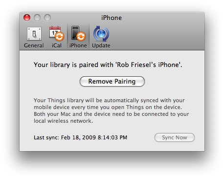
I’m not sure if there is a good answer for this question. For folks that use the iPhone version of Things and not the desktop version, I find it unlikely that they will run into any performance hits quickly enough to warrant some sort of auto-pruning configuration option. Or maybe it’s a preference that belongs in the desktop version, right here:

Maybe you tell it: “Only sync 90 days worth of Logbook entries”? Perhaps that’s one of those “easier proposed than executed” propositions of software development 3.
But now, on to new business!
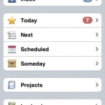
Things for the iPhone. Things was the first (and thus far only) application for the iPhone for which I paid any hard-earned money. It seemed silly to not get this as the companion app for the only task manager I’ve ever come to like. In the brief time I’ve been using it, I feel that the money was well-spent – it has streamlined some of my task-related book-keeping exercises. Maybe it’s just a placebo – but science has shown us that even a placebo can make you feel better.
The folks at Cultured Code made some excellent decisions in designing Things for the iPhone. Once again, let’s turn to Shawn Blanc’s article for some excellent observations:
There are two dynamics to successfully building two versions of the same app onto two unique platforms (one for iPhone and one for the Mac).
Both apps need to feel native on their respective platform. The iPhone version needs to feel like it belongs on the iPhone app, and the desktop version needs to feel like it belongs there.
This doesn’t just mean the GUI should be different. It also means the layout and display of core functionality, along with the flow of navigation and the user interaction within the application all have to pull together to form a well developed iPhone app that still has striking familiarity to its desktop counterpart.
It’s like the difference between Clue the board game, and Clue the card game. Same game, completely different implementation and interaction.
Both apps need to feel like they are the same app. Meaning, the Cultured Code team had to reconcile the two-fold need for their iPhone version of Things to feel like a native iPhone app while also feeling like the very same application they made for the desktop.
Both excellent points, and ones that echo sentiments made by the Cultured Code development team. But it’s more than just the look-and-feel. These smart decisions are also reflected in the mechanics of the application. Take the syncing, for example: Cultured Code programmed Things to sync over Wi-Fi instead of piping the application data through the “usual” iTunes sync procedure. The advantages of this were instantly clear to me: (1) you can sync any time you want without getting bogged down with other miscellaneous application syncing and (2) you can sync with whatever computer happens to be the one with your master copy of Things is on 4. Maybe the answer is simpler than that; maybe a custom sync engine that operates over Wi-Fi was easier to stub out than one that tapped into the sync-through-iTunes API 5.
But beyond these mechanics, beyond even the much celebrated attention to the look-and-feel aspect of Things’ design, there is a sense that these developers really and truly thought through what it means to have a to-do list.
Stop right there for a second.
You’re probably about to blurt out your first response: So what? You write shit down and cross them off when they’re done. But seriously. Stop and think through for a minute what it means to have a list of tasks or to-do items. You can do this little mental exercise on as micro or macro a level as you would like. Okay. All done? If you didn’t make the connections between your task list and your calendar then you didn’t finish thinking it all the way though 6.
There is a complex, interdependent 7 relationship between The Things You Need To Do and that 7×5 grid on which you put your Appointments And Other Blocks Of Time. All of your tasks (all of them) take up some block of time. It might be a five minute phone call, a fifty minute debugging session, or a grueling five hour meeting. All of them add up, and any of them might be served just as well by a block drawn into your calendar’s “Today” column as they are as rows in your “Today” bucket.
“Might be”.
I phrase it that way because while all tasks take time to execute, they’re not all discrete events. Some tasks (e.g., scheduling a physical with your doctor) are quick to perform but are also easy to postpone more/less indefinitely; these are not discrete events. Things does a superlative, downright elegant job of handling this convoluted relationship between tasks and appointments. The iPhone version’s UI apes aspects of the calendar to reinforce these parallels; and on the desktop, we have an intuitive means of scheduling, deferring, and recurring tasks. This aspect of the Things UI is worth the price of admission by itself.
So where does that leave us with Things? It leaves us with a simple and intuitive (, great) task list manager for the Mac/iPhone that made it across the beta finish line with a stable, polished, and worthy 1.0 release. This isn’t to suggest that Things is perfect: there are the Logbook syncing issues (vide supra); I’ve never seen the “Show in Project” button work; and I still think the file attachment links could use a little burnishing. That said, Things’ core functionality seems solid and the key UI elements – the overall look-and-feel, the visual metaphors and analogs, etc. – are all solid.
Highly recommended.
Things is available for purchase and download at the Cultured Code online store; $49.95 USD.
- That Shawn Blanc review linked above is a good one, if you’re so inclined.[↩]
- Example: Filtering by tasks tagged with “writing” are going to number in the hundreds, easily. During 2008, I had a daily recurring task with a title of “write for 1 hour everyday” on top of every other writing-related task (e.g., “complete revisions for short story XYZ”). But that said, I’ve used the tags in the iPhone version even less than I’ve used them in the desktop version.[↩]
- Like asking why it’s using an XML file instead of SQLite?[↩]
- Q.v., the slight rant under “Iffy on syncing” at 2 weeks with the iPhone.[↩]
- Disclaimer: I have not checked if there actually is an API for setting up your app(s) to sync through iTunes; it does seem like a reasonable assumption though.[↩]
- Sorry, no. You didn’t.[↩]
- Co-dependent?[↩]

Leave a Reply