font wars
¶ by Rob FrieselMostly for Pete, a follow-up to a thread on Facebook today…
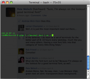
The co-worker’s terminal font (click to make big):
Now I used to have a big fat crush on Andale Mono but how could that be easy on the eyes? The painfully mucky tilde, the one digit and the lowercase L practically indistinguishable! And at 9pt? Holy cow that’s tiny.
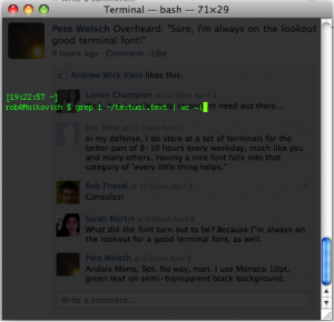
Now Pete’s:
A wiser choice. The one digit and the lowercase L are more distinct (though the latter is not all that distinct from the pipe). A nice swoosh to the tilde. And even at 10pt, it is nice and legible. Still, there’s something about Monaco that’s always been a little unsettling to me. Like the legs on the lowercase M are too bunched together maybe…? Never could put my finger on it.
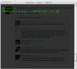
Now, Consolas, that’s the fixed-width font for me:
Now I know what you’re going to say. “Weren’t you just busting on Andale Mono for the one digit and the lowercase L being too similar-looking?” Yes. But there’s always that risk 1. I find the “1” and the “l” here to be sufficiently distinct. Especially at that luxurious 14pt.
- Swing too far in the opposite direction and you get a lowercase L that looks like a pipe, eh?[↩]


Leave a Reply