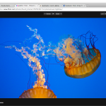
the new Flickr photo page
¶ by Rob Friesel In case you haven’t heard yet–Flickr is rolling out a new photo page (pictured here) and I must say… It looks great. Congrats to the team that worked on this, they did a hell of a job.
A few notes that I pulled together from playing around with it this week:
 The lightbox mode is gorgeous.
- Many of the actions previously available as buttons just above the picture are now inside of an “Actions” menu. This consolidates them and I think that for most folks it will make more sense–the menu has a little better contrast than the previous action buttons: a slightly darker color, a border, a disclosure arrow… Overall, I like this improvement.
- That said, certain adjustments seem a little bit too buried. Example: there is not easy (i.e., one-click or even “two-click”) access to adjusting the photo location. This is a big one for me 1 because I tweak these all the time. In this particular case, it wasn’t too tough to figure it out. When I did not see an “adjust this location” link under the map, my first instinct was to click on the map. That was close… You have to click on the map, then click “Edit location” on the thumbnail, then drag/drop the thumbnail, and then you can adjust the privacy settings and save your adjustment. So not too bad–but it does seem like a few extra clicks.
- I’m still getting used to the whole “title under the photo thing”. It doesn’t seem wrong or incorrect, but I’m also not accustomed to it yet.
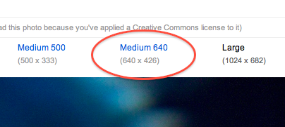
- I haven’t seen this promoted too much but… new “Medium” size! It used to go Small (240px on the longest side) âž Medium (500px on the longest side) âž Large (1024px on the longest side); now there is a “Medium 500” and an additional “Medium 640” (640px on the longest side). Convenient.

Lastly, I saw the following comment on Facebook attached to the post announcing the new photo page. The guy wrote:
…I find it ironic that Flickr has finally moved to a larger page layout as smaller screens have started to regain popularity.
I definitely disagree here. Smaller screens are more popular now? Which smaller screens are we talking about here? Netbooks, and/or mobile devices? Both have become more popular and mobile devices are becoming ubiquitous at this point, but it would be a huge mistake to design for the lowest common denominator. And by “lowest common denominator”, I’m definitely talking about the netbooks. Mobile devices have already gotten first-class treatment by Flickr; if you haven’t seen it, check out m.flickr.com. It’s a great mobile-optimized site and if I’m not mistaken, the new Flickr “main” site certainly took quite a few cues from the mobile site 2. So though smaller screens are more common now, I think it’s because devices with small screens have become popular–but that said, most folks probably won’t choose to “go deep” with Flickr on a netbook. And even if they do, I’m sure it will still look just fine.
- Two reasons there: (1) the iPhone’s geotagging often needs to be moved because they’re often miles off and (2) although I want my default visibility for a photo’s location to be “everyone”, I also lock down many of them to be “Friends & Family” only (even if the photo itself is visible to everyone).[↩]
- E.g., putting the title beneath the photo.[↩]
Leave a Reply